TASK ONE
MOOD BOARD
|

|
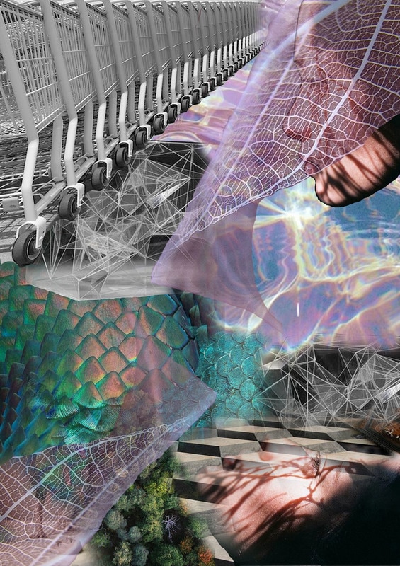
In the first moodboard i edited the image and changed the colour so it has a variation of tone. i cropped each image and cut out the back ground so i was able to rotate them to different angles. If you look closely not one image is at the same angle as the other image. this masterpiece took hours to make as it involved a lot of concentration and skill. my favourite moodboard is the first one as the colours are cool and chilled out. the makes me feel relaxed and happy as it has subtle colours such as blue, baby pink and white. i related it to the theme labyrinthine and got images such as abstract art to relate to mazes and confusion. i found out that most natural forms such as leaves and plant have more abstract art with the roots, stems and intricate designs deep within the object.
MOTIF
|
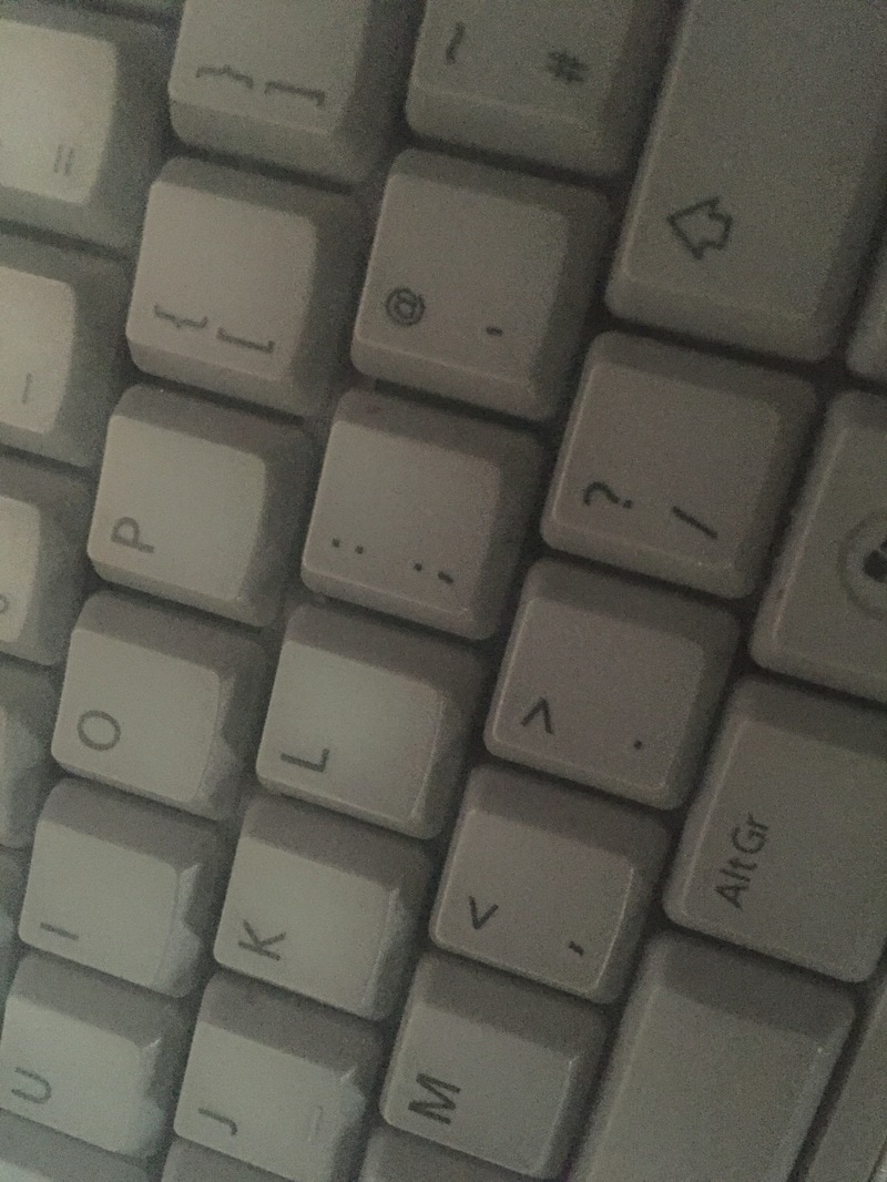
A motif is a decorative image or design, especially a repeated one forming a pattern. This usually occurs on a piece of fabric of graphic design. instead of directly relating it to a motif pattern i will relate it to the idea of repeated objects such as repetition architecture. In general everyone's day to day life is a motif repeating the same things again and again. personally my life is a motif as i have to go school almost everyday and work this repeats itself all the time. This relates to London underground as that is the basic city life travel. I would know this as i take train to central London every week. this starting point is one of my strong points (everyday life) and i believe i can capture everyday things that people would love to see relating with repetition.
|
CONFUSING

|
To make something confusing it means to make something complex or causing bewilderment. this strongly supports my theme and personality. i am a crazy quirky and confusing person and by putting it into my final piece i believe it will show the viewers and London underground what Jamila is like and how her mind works. This will help to collaborate with the theme of London underground as it is confusing with over 10 lines running through the city. It also gives me the opportunity to link all three things together such as my personality, London underground and labyrinthine.
|
TASK TWO: ARTIST RESEARCH
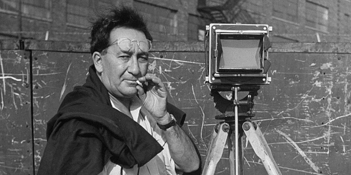
Aaron Siskind
|
Aaron Siskind born December the 4th 1903 was an American photographer known for considerably relating his work the abstract expressionist movement. Siskind worked in both new York and Chicago he focused his work on nature and architectural structure. Siskind did not choose to be a photographer the idea came about when he received a camera as a wedding gift and from there on Siskind decided to take abstract photographs of nature and architectural structure. he takes pictures of found objects that were simultaneously true-to-life and abstract and combines them together.
|

|
|
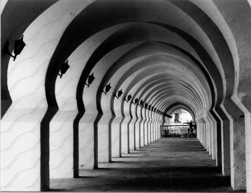
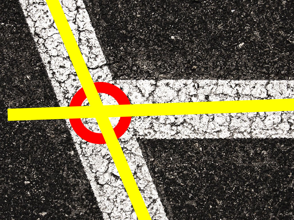
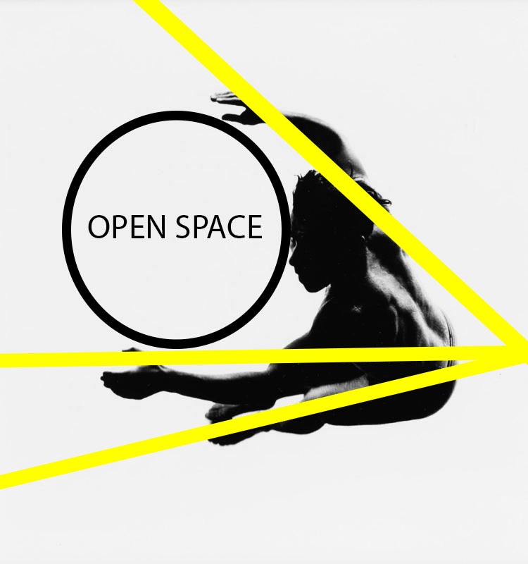
This photograph is a road but it is zoomed in so you can see the abstract details within the cracks. the shapes and forms consist of man made lines which are geometric. this image is both 2-dimensional and 3-dimensional as the lines and shapes are 2D but 3D elements such as the old paint come off. the meeting point for both the white lines are to the Left hand side of the image so the center of attraction is to the side. Siskind explores the different shapes and textures within the image. I would like to use his work as inspiration towards my work as I feel it relates to my work best. I intend on creating different pieces of images with different textures and shapes. I also intend on studying his use of open space and center of focus.

|
|
Analysing his work I can see that he does not use Centre of focus in the middle of his work. It is always attracted to the corners of the sides. he has a wide use of open space and how much space he leaves to give it a great but simple effect.
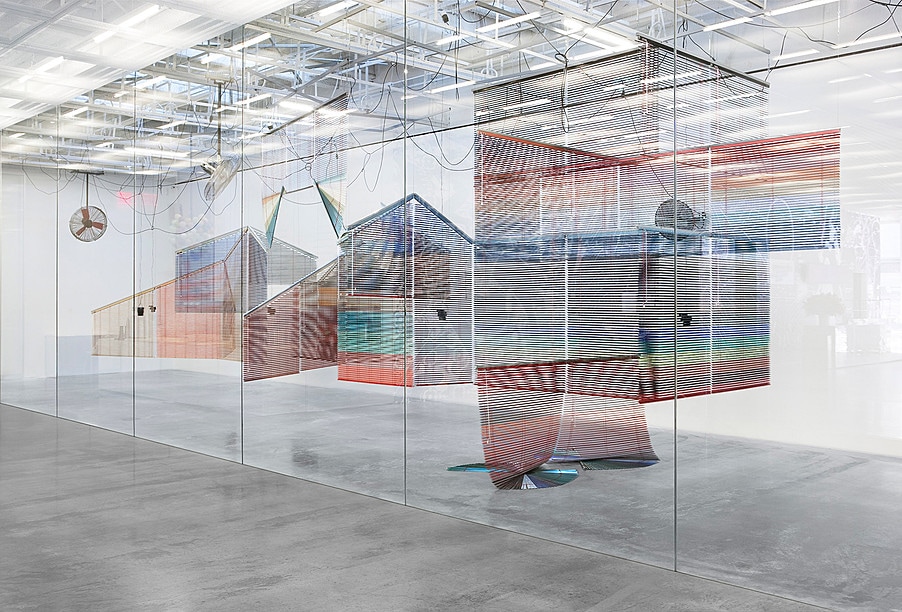
Haegue Yang

|
|
This abstract piece of art was created by the one and only haegue yang contributing towards her dress vehicles exhibition in Tate modern art gallery.
TASK THREE: INITIAL RESPONSE PT.I
During this project i have been asked to join the ART ON THE UNDERGROUND scheme in creating an authentic piece of art for ART ON THE UNDERGROUND They have asked for submissions from young artists, photographers and designers who live and work in the capital. the set theme to the response to the brief is labyrinthine. we have also been provided with the judging criteria of the brief. this includes DESIGN this asks if your work shows a high degree of photographic mediums and techniques relating and reflecting onto your themes. it needs to show INSIGHT, is it unique and well thought of? COMMUNICATION, can people understand the meaning behind the piece? INSPIRATION, do you believe your work can inspire others to do great as well?
TASK FOUR: INITIAL RESPONSE PT.II
Over the next couple days i will be forming a photo shoot corresponding with my theme labyrinthine. while taking these photos i will be considering my starting points 'motif' and 'confusion'. To make sure i get the photos correct and make sure they relate to my theme, the client (transport for London) and my starting points i will print out a A4 sheet of things relating to them such as multiple windows, tube lines, bus lines ect. Each image will have at least one starting point relating to the theme. i dont have a specific place to take my photos so i will be taking pictures around me. my photos will be from day to day life such as my journey to and fro school, my journey to a fro work and around my area which is surrey quays.
TASK FIVE: INITIAL RESPONSE PT.lll
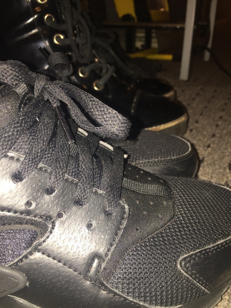
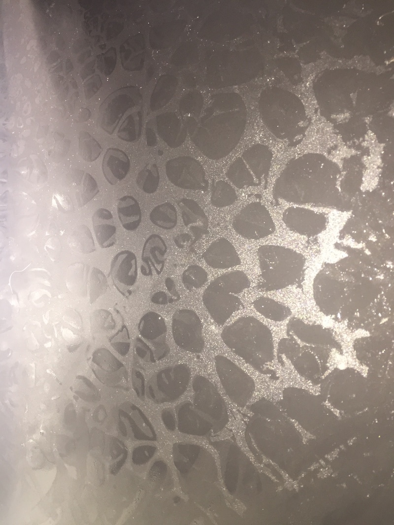
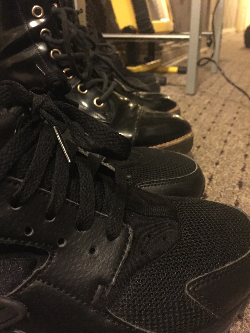
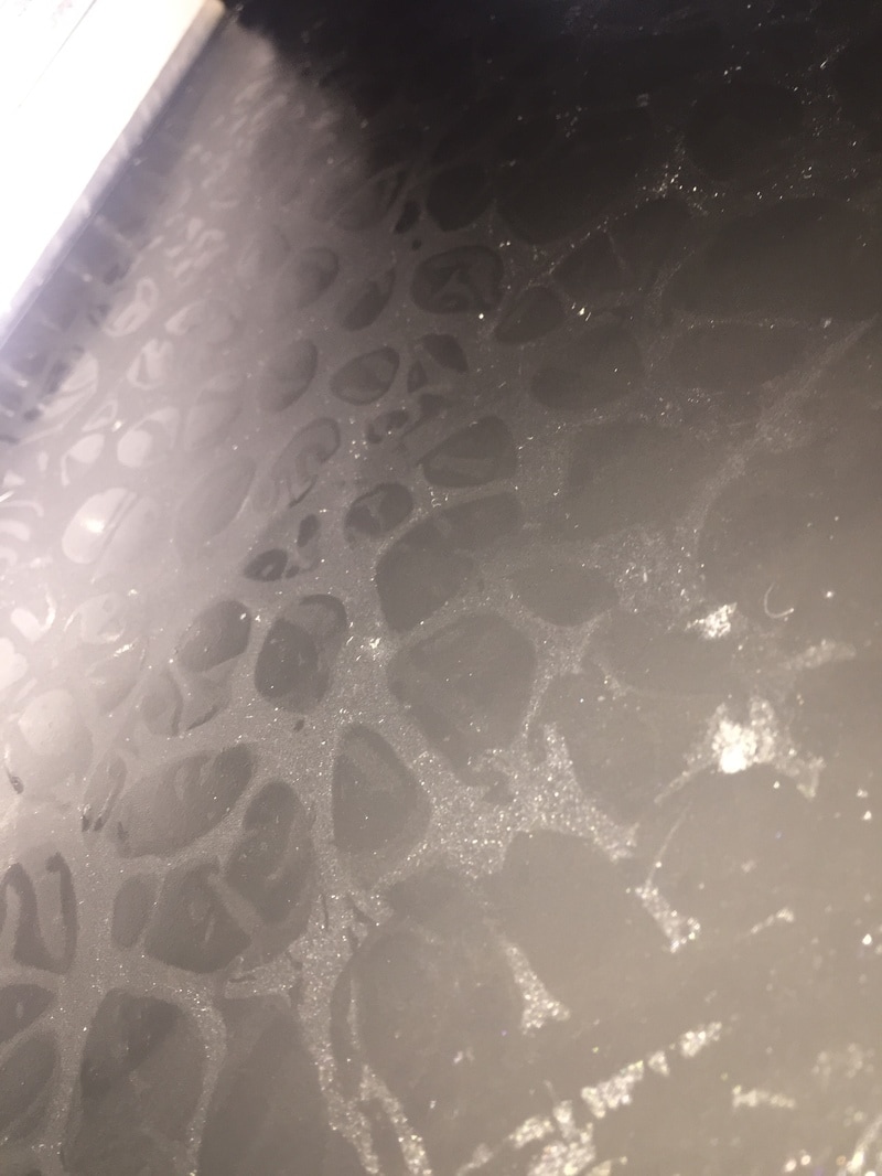
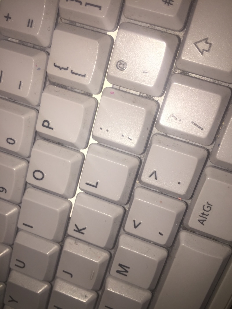
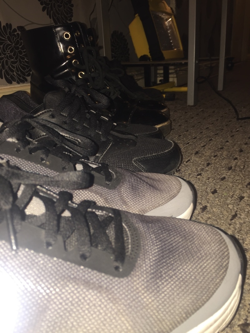
in task 5 i was asked to take a picture of things that related to my theme and starting points MOTIF and CONFUSION. the first six photos were taken in my house. I lined some of my shoes up so it looked like a consistent motif between them i then turned the background light on in the second picture to take the light off of the shoes. The 3rd row of photos were taken of my school work. it wasn't planned as oil accidentally spilled in my bag and formed a confusing pattern. it looked like scaled that related to my moodboard coincidentally i took the photo and uploaded it to my weebly.


|
|


|
REVIEW ON PHOTOS
NEGATIVES

|

|

|
these three photos were unsuccessful as they did not relate to any of my starting points even they had me confused and lost on why and how it related to the client. i wasn't able to upload it and relate it my theme so i got rid of it and reflected on the image and where i went wrong it was rushed. To add to that the camera was not focused on the subject so it did not come out as clear as i wanted it to be.
POSITIVES

|

|

|
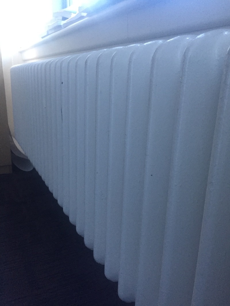
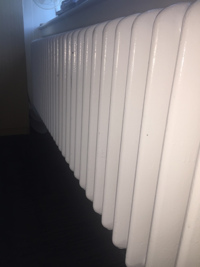
These three photos were very successful as they related to the theme motif and confusing. the picture relates more to labyrinthine as it was weird and wonderful patterns that curve and splatter. the second image relates more to my starting point confusing and in the background it has a motif of patterns on the radiator. i thought about this image in advance so when i edit it, it will all make sense. although the lighting in the 3rd image is really bad i will try to edit it to make it look vibrant and normal.
INITIAL RESPONSE PT.IV

|

|

|

|

|
|
TASK SEVEN: EXHIBITION REVIEW
|
|
|
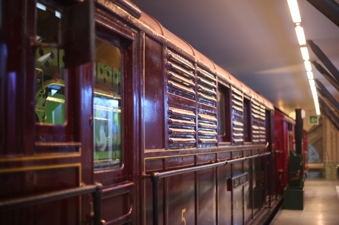
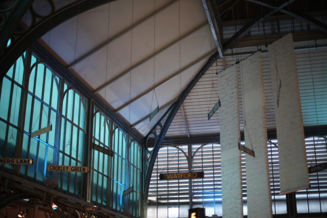
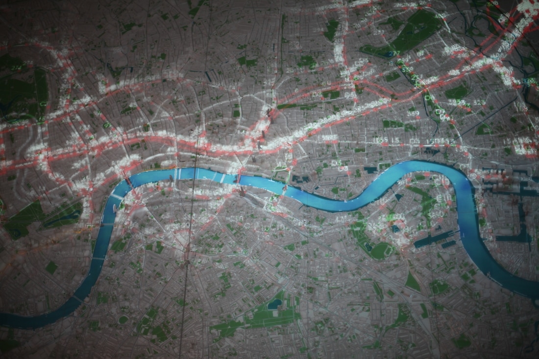
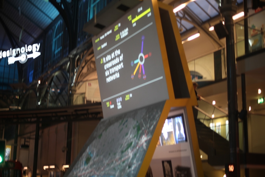
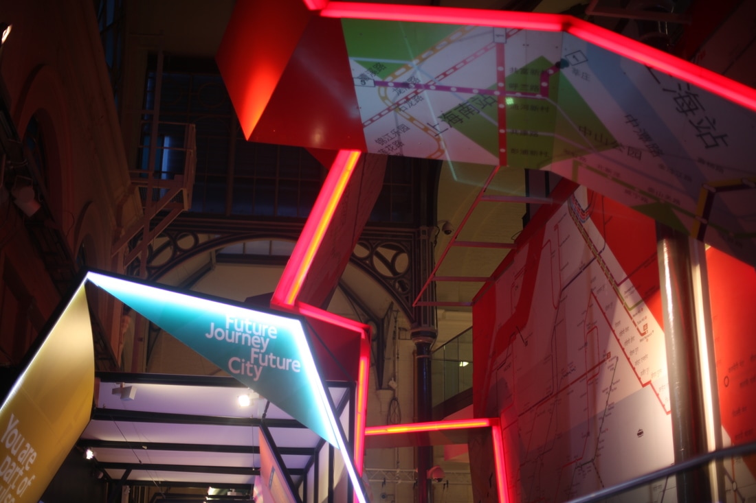
Over the holidays I visited the transport for London museum it was a unique and uplifting experience as I felt It shed some light onto my project and the client. I am capable of understanding the history of transport for London and what they are looking for. I would recommend the transport for London museum to a friend as it has more answers that you wont find on the internet . Personally it made me feel like I was able to travel back in time to see what all the old buses and trains looked like, I also got the feel. At the museum I was able to enter old train carriages and buses. They had many interactive activities such as team building workshops and many more for children so I would recommend this museum to families. most of the things there related to my themes both confusing and motif. most of the carriage designs repeated themselves so I was able to take photos of them. the intricate designs of the map can go towards my work when I develop it on Photoshop. I would give the museum 4 STARS because it was really good as it had all the answers I was looking for but I was quite small so my visit was short.
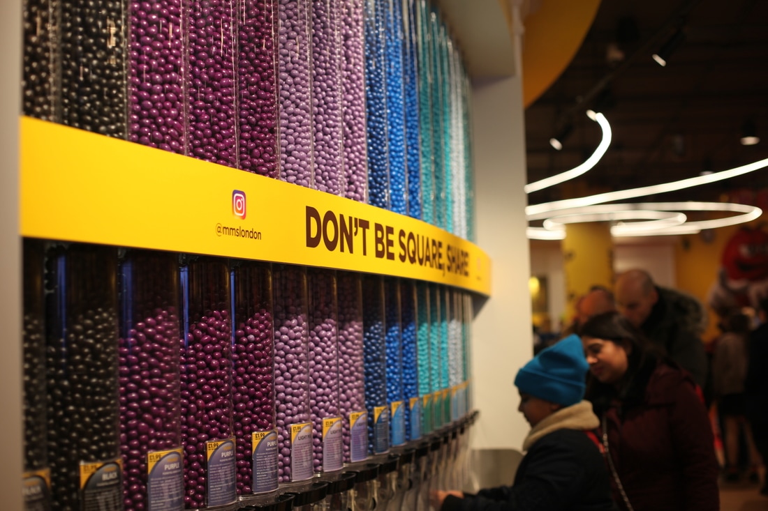
TASK SEVEN: JOURNEY TO EXHIBITION REVIEW
|

|

|
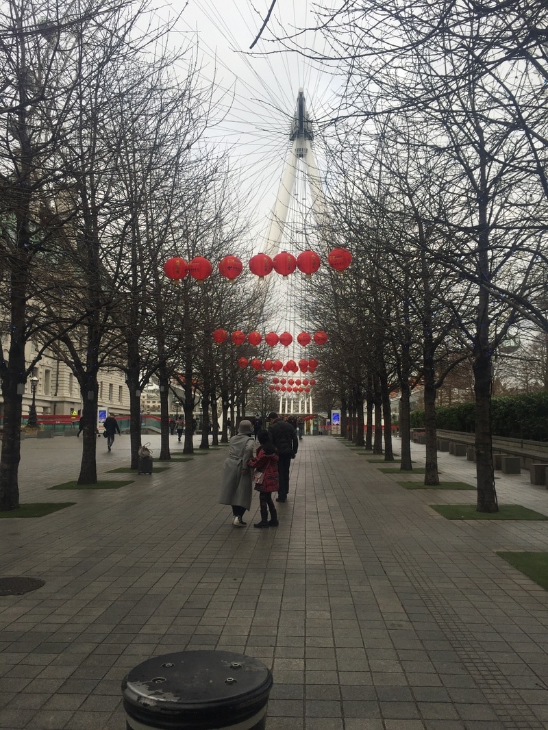
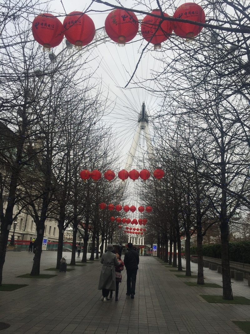
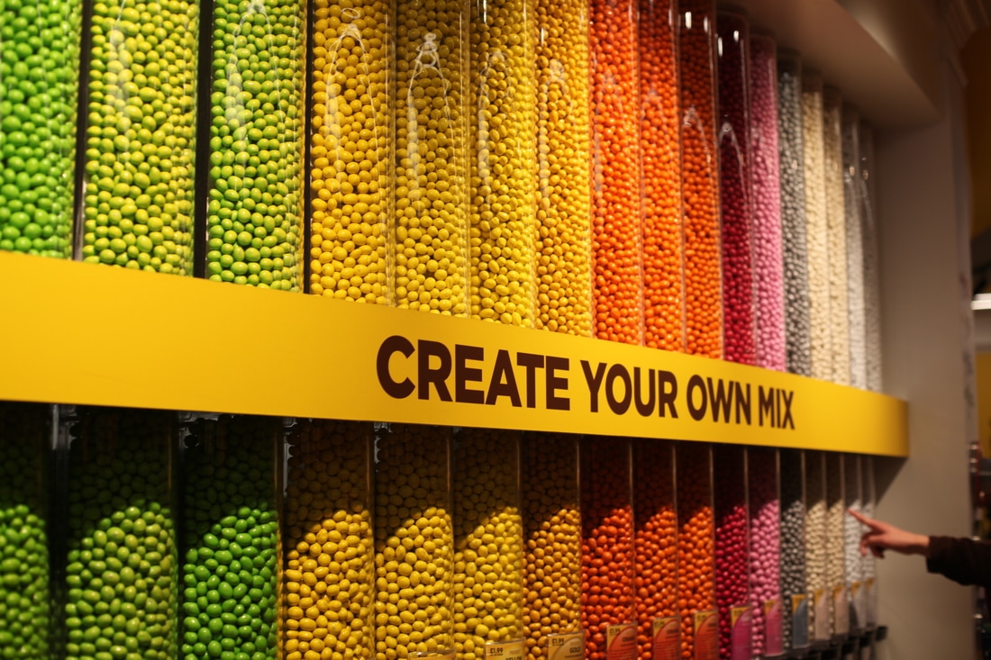
Instead of just taking pictures of the museum I took pictures on my journey fortunately iwas able to stop by at different places such as M&Ms world with all the colourful motifs and confusing patterns.
TASK EIGHT: MOCK UPS
|
|
|
IMAGE 1

|

|
IMAGE 2

IMAGE 3 |

IMAGE 4 |
TASK NINE: PEER REVIEW


|

|

|

|
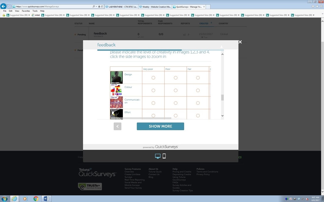
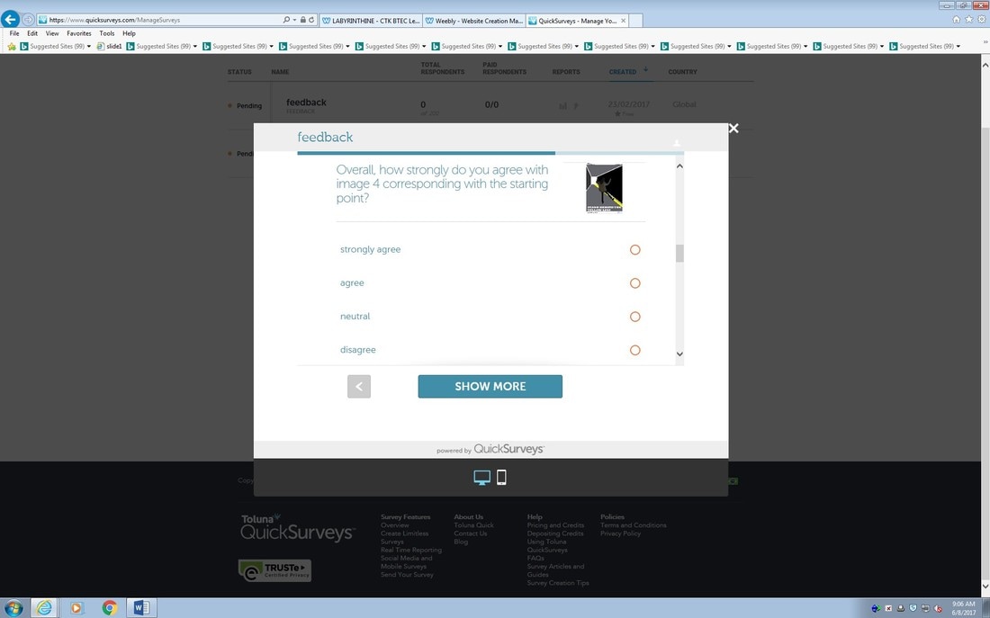
to gain crucial feedback for my work I handed out online surveys. I used a website called Toluna (quick surveys) to create questions I felt were affect to the research of my theme and feedback of my designs. each question covered the basics such as colour, message and effectiveness. I placed a link below and told my peer5s to head on to the website and leave a review. to top It all of I did a one to one with most of my peers to ask for personal feedback and the comments were very useful. one peer sai8d "I find the colours contrast to much and they6 do not make sense to the human eye. I also find that the images made on Photoshop show look unprofessional as they are not clean and developed you could say they look very childish". I believed this truthful feedback will help me develop my ideas and techniques. in future when building new designs from scratch I will start off with a basic/ simple tool or I will create my own shapes on Photoshop. around 15 people took my survey so it gave me a wide range of feedback and a wide range of ages and gender as I posted it on my personal social media as well to get other peoples thoughts and not just my peers.
https://www.quicksurveys.com/s/Gt26Y
TASK TEN: OFF-SITE SHOOT

|

|


|


|


|

|

|
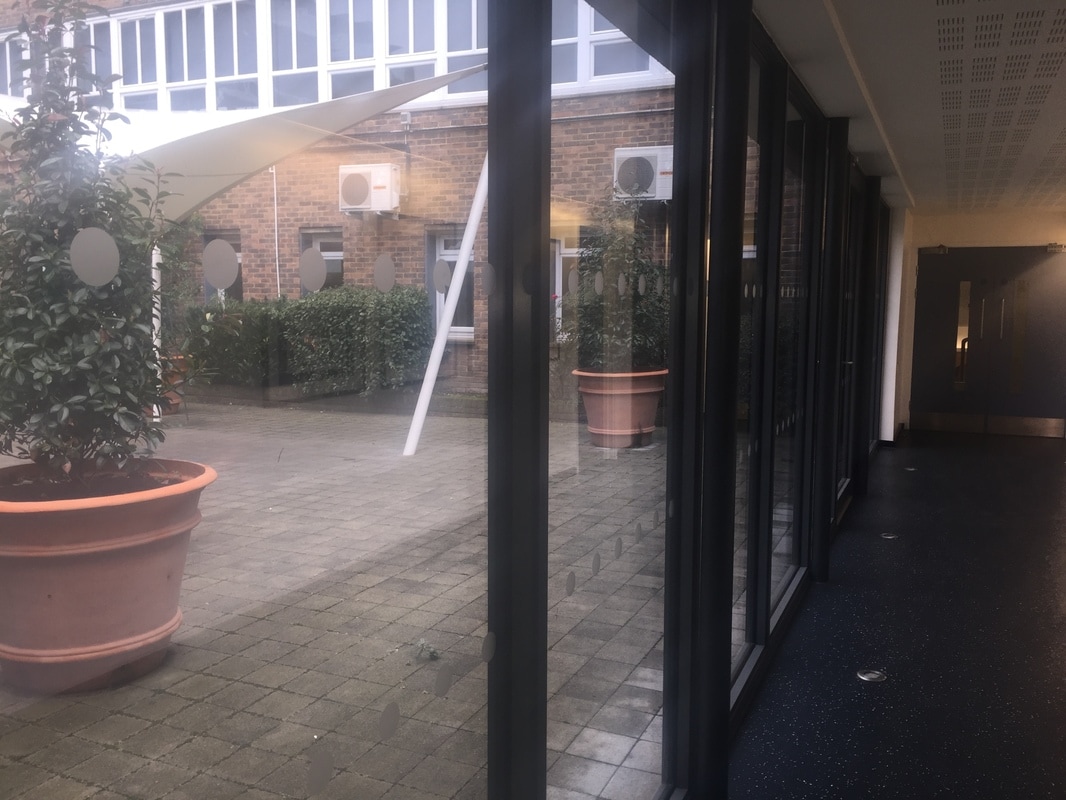
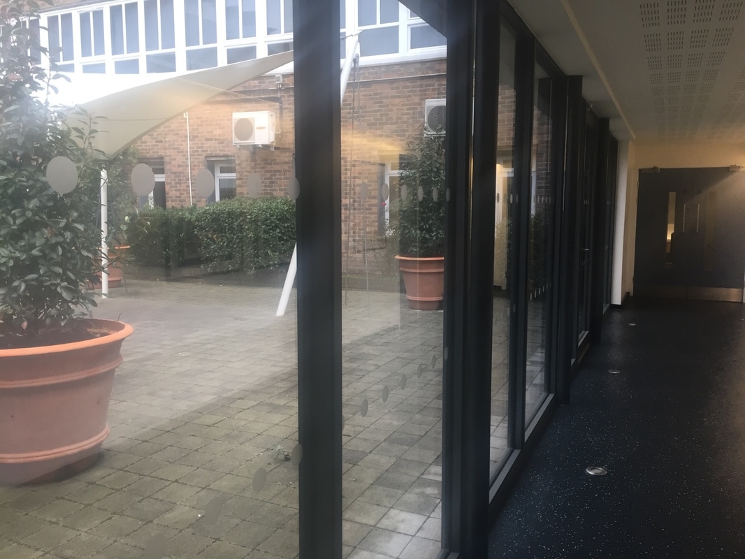
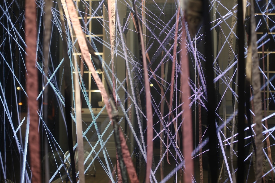
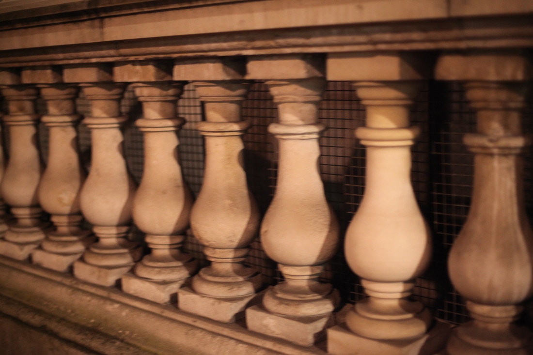
Task ten involved me taking off-site pictures of things that related to my client theme, and starting point. focusing mainly on the idea of intricate designs that shows similar aspects of motifs such as streets lamps that are aligned one after the other, buildings that have 3D elements coming out. that fact that the colour pops out of some of the images makes it unique and eye catching. where as some images contrast with that and show dull boring colours, so its a good aspect of juxtaposition.

|

|

|
TASK ELEVEN: PHYSICAL ADJUSTMENT

|

|

TASK TWELVE: TERMINOLOGY CHECK
Exposure - The amount of light needed to make a photograph.
Under-exposed - Allowing too little light into your camera for your photograph. Your photo will be too dark or black.The main object, or thing that is the main point of your photo.
Focal Point - Where the viewer's eye rests in your photo, the main point of focus.
Composition - The arrangement of subjects and objects in the frame of your photo
Subject - The main object, or thing that is the main point of your photo.
Rule of Thirds - The composition technique that breaks your frame into 9 even squares, and concentrates on keeping your subject outside of the center square, to keep your viewer's eye moving around the composition.
Single Lens Reflex (SLR) -A camera with a movable mirror and detachable lenses that allows you to see exactly what you will be photographing.
Golden Hour - The time of day that gives the best light for photographing generally during the first and last hours of light during the day.
Lines - The composition technique concentrating on lines to make your photograph. Vertical - mean power and strength. Horizontal lines show relaxation and calm. Diagonal lines show movement and are dynamic. Leading lines bring the viewer's eye into your photo and show depth.
Resolution - The number of pixels per inch in your image. Often referred to in pixels per inch or ppi. A higher number will give you more detail and fineness in your image.
PPI - Pixels Per Inch - The amount of pixels per inch on your screen or image - the number talks about your resolution. Larger numbers will give you more detail and smoothness in your image.
Shadow - When properly used, they will create depth, contrast and added interest for your viewer.
Flatten Layers - Do this only before you print - you should always keep a saved version of your photo that is unflattened, so you can go back and adjust as you need to without having to start over completely.
Contrast - The range of difference between the highlights and shadows in your photo.
F-Stop - The number defining how large or small your aperture is set to. Smaller numbers (1, 1.4, 2, 2.8) equal a larger opening, whereas larger numbers (22, 32, 45, 64) equal a smaller opening.
Framing - The composition technique using objects in your photo to frame your subject, creating depth and interest.
Aperture - The opening in the lens that allows light to come through to expose your photo.
Shutter Speed - The amount of time the shutter inside the camera is open to expose your photo.
Over-exposed - Allowing too much light into your camera for your photograph. Your photo will be too light or white.
Depth of field - The section of the photograph that is in clear focus (can be deep or shallow).
Film Speed/ISO - The sensitivity of the film or the digital sensor to light, if set too high the image may be grainy.
Perspective -
TASK THIRTEEN

|
|
|
releasing my mock ups made me realise I had a lot to do. I was able to recap my ideas and think about how I got where I am now. my ideas are to basic and they relate to the theme directly I intend on changing every single one of the posters or flyers so they look more appealing and professional. I also intend on changing my process instead of merging and cropping images I will be distorting and liquefying my designs so they have a vibrant and crisp look.
TASK FOURTEEN
over the term I plan on covering four bases of my research, I will research a photographer, visit an exhibition, visit a location and find a different technique.
A. I will research an artist that I believe relates to my structure of work and also my theme. I have quite a few artists in mind but I will soon narrow them down when it gets to the research. hopefully this will influence my work and give me inspiration. Fred Tomaselli is an artist I have in mind at the moment.
A. I will research an artist that I believe relates to my structure of work and also my theme. I have quite a few artists in mind but I will soon narrow them down when it gets to the research. hopefully this will influence my work and give me inspiration. Fred Tomaselli is an artist I have in mind at the moment.
|
|
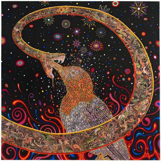
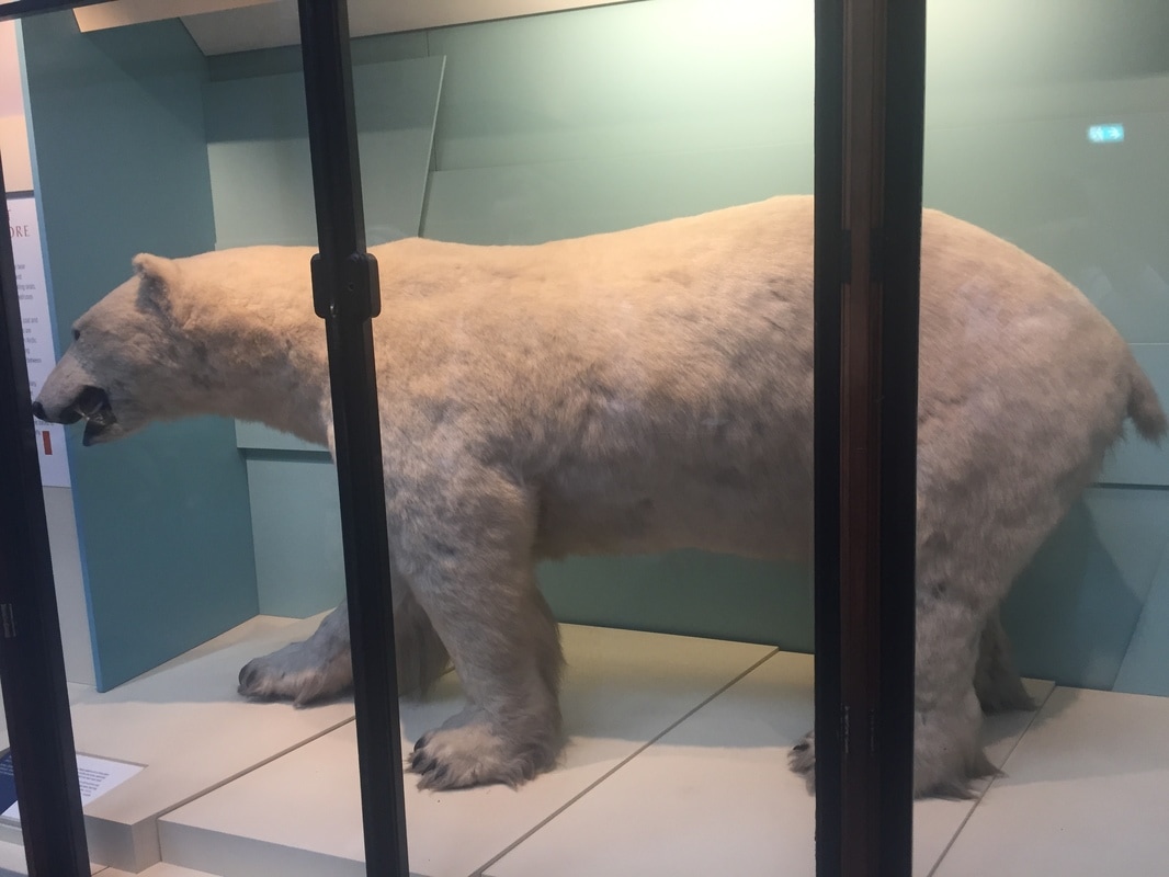
B. I intend on visit a different type of museum unlike the other ones I have been to. usually it is a basic museum about photography or art. I will be attending a museum about animals called the natural history museum. this includes realistic sculptures of animals that are extinct such as dinosaurs. I believe this will be good for my work as the animals all have different texture on there skin such as feathers scales and fur. this will go great in my work and I will have good inspiration for it.
C. luckily I have had the privilege to go to another country to do my photo shot. I will be visiting France over the term. this will switch up my work instead if having the same location in London such as central I will be headed of to a new territory something completely out of my comfort zone. I hope to see famous landmines such as the Eiffel tower and many more as I am interested in the external structure.
D. I will try different techniques one being distortion. this means I will be creating different illusions with my camera many focusing on buildings. I will also bring the use of my photograms into this.
TASK FIFTEEN
A. ARTIST RESEARCH
Fred Tomaselli:
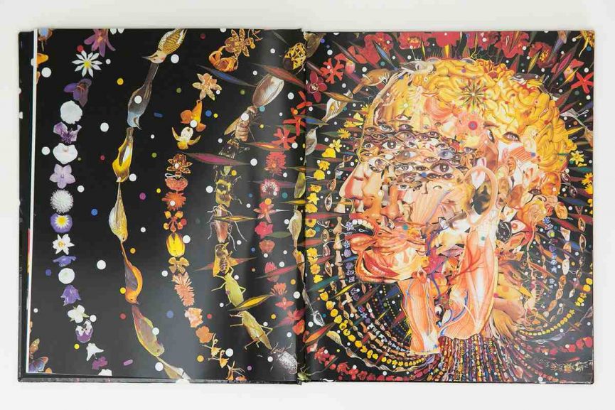
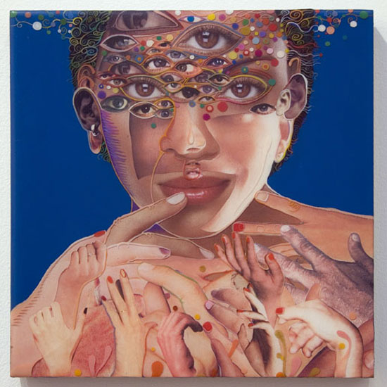
Fred Tomasellis is a well known American artist who depicts his pieces of paintings on wood panels. Tomaselli's paintings includes medicinal herbs, prescription pills and hallucinogenic plants alongside images cut from books and magazines. Tomasellis thinks outside of the box and believes his work takes people into a surreal world. I chose Tomasellis as because his work depicts confusing things that relate to my theme and most of his patterns are repetitive I believe this will help me develop my final piece into something unique and extraordinary. I would like to use one of Tomasellis weird traits such as adding magazine or book cut and maybe. I plan on creating some outcomes by hand adding pieces of magazines and newspapers to give it a confusing look. I have looked into Tomasellis techniques and I can see that he puts his medical substances onto his work first then he layers it with newspaper and magazine cut outs. making sure everything is dry and crisp. Tomaselli only uses body parts and parts of nature in his work to tell a short story through the mind.
|
|
B. One exhibition I went visit
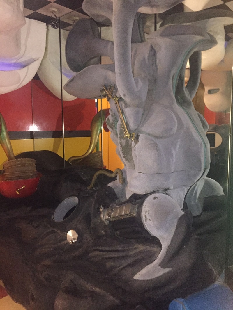
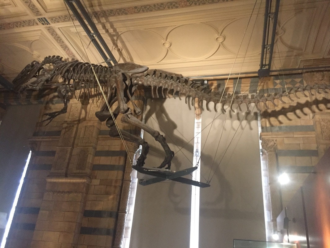
Natural History Museum:

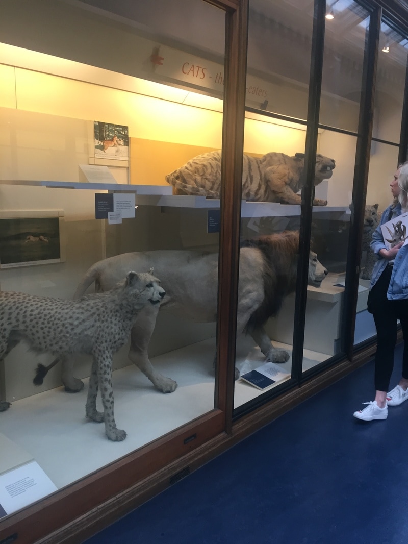
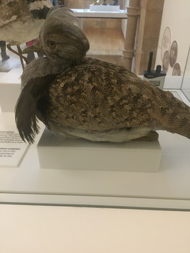
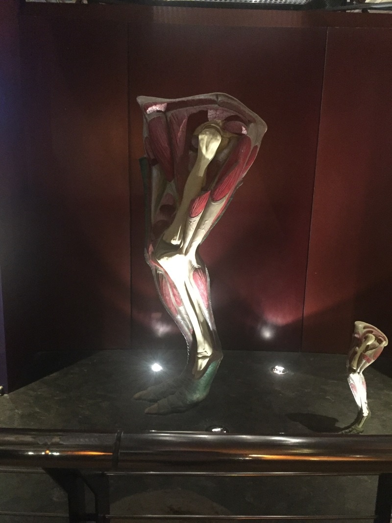
I went to the 'Natural History Museum' located in the south Kensington/ Chelsea. I decided to visit this museum as I was studying confusing and motif patterns. I went into depth and went into the animal sections and explored and focused on the animal patterns and skeletons. the repetitive patterns and structures of the animals relates back to my theme I can see they are unique patterns that have not been tampered with by mankind. I also studied the structure of the building and the architectural designs and patterns the floor boards showed motif as well as the exhibition stands. I used my iPhone 6 to take the images some with flash and some without. I can incorporate some images I took from the museum into my work and focus on the repetitive patterns that make a motif. it has made me broaden my research into to patterns its not just straight forward patterns that keep repeating to maker a standard motif, its also patterns that repeat in different directions such as the second image of a extinct bird.

|
|
|
C. One location i visited to take photographs
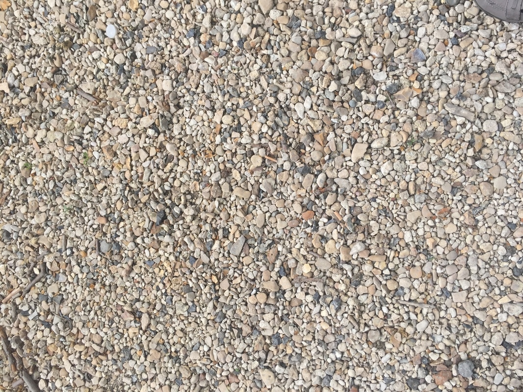
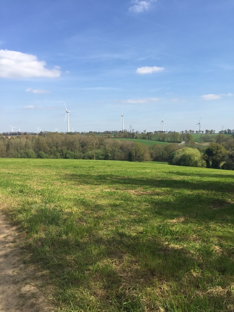
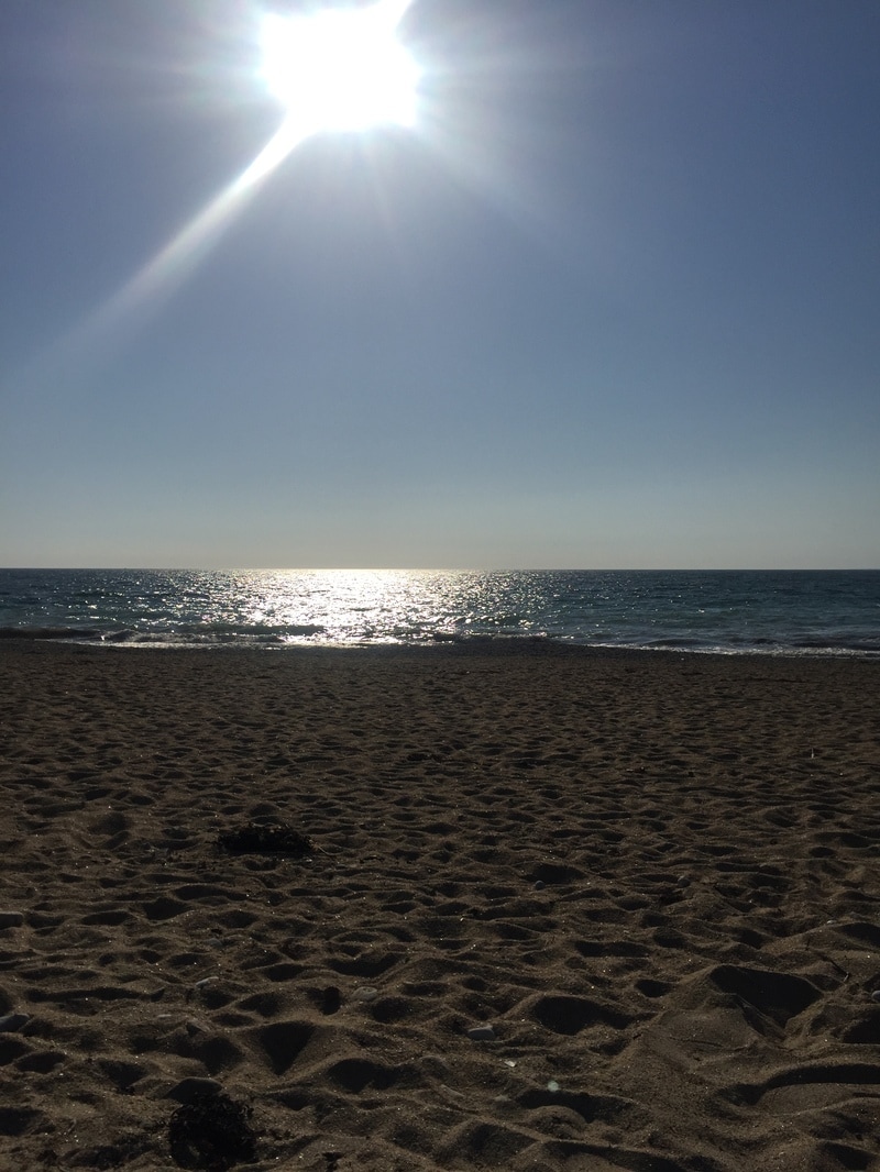
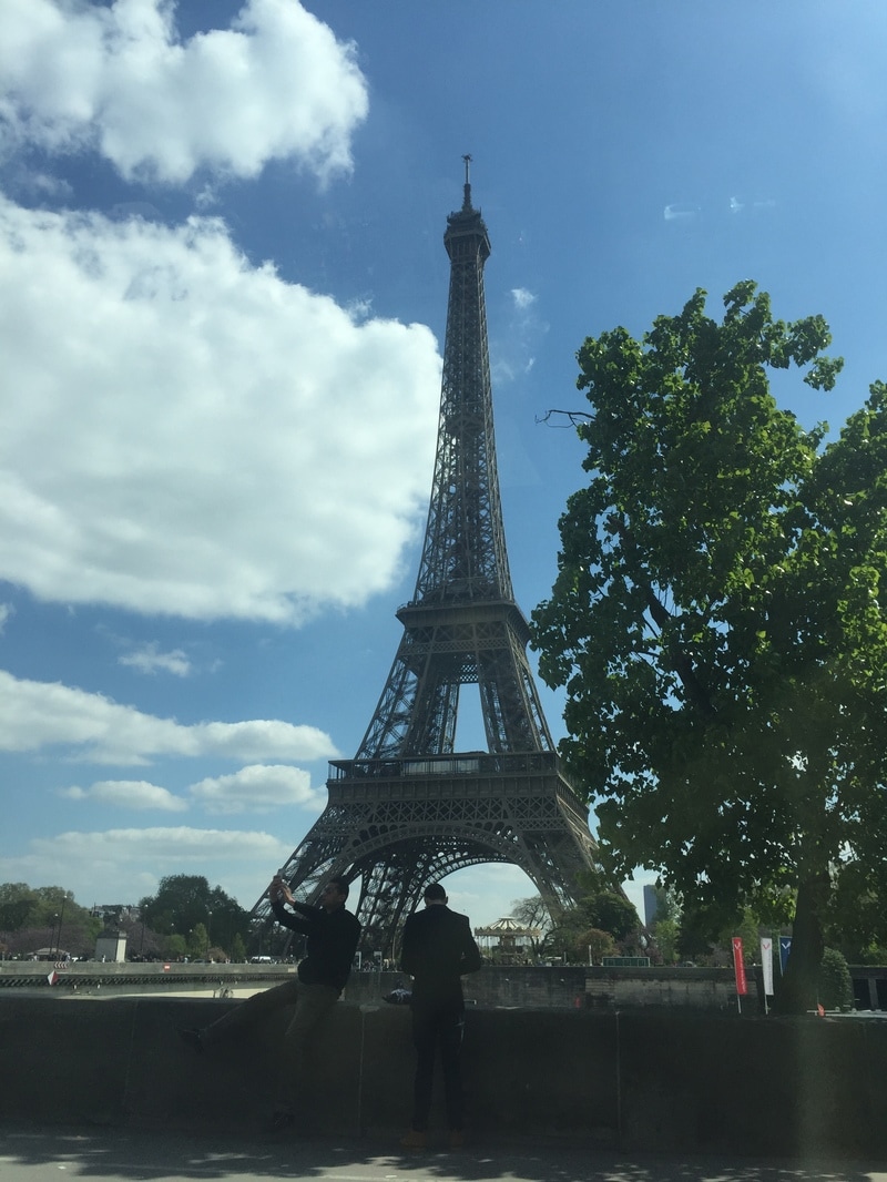
I travelled to two locations one being France and the other Chelsea. I was on a short holiday and decided to go to France and explore my themes there. going to France made my work a bit more fascinating and unique as no one else went to another country to take their pictures. I didn't just sight see like other people I made show I focused on my theme when I went there so I was able to sight see much. I took pictures of nature and man made patterns such as shells, stones buildings and famous monuments. my favourite photo is a close up of the Eiffel tower as it shows confusing complexity within the structure. the lines follow each other in different directions making the structure balanced and tall. I was fortunate to attend both the city and the country side (Brittany). I was able to capture the country side and the beautiful patterns it portrays. fortunately I was also able to go to beaches and pick up shells so I have a vivid Idea on how I'm going to incorporate my patterns and designs into my final piece.
|

|
|
|

|

|
TASK SIXTEEN
I created a quick 5 minute presentation on the upcoming development of the recent work that I have been doing starting from my recent photography research. During this presentation I was asked a few question from my peers. someone asked me "if I intend on using my work I got from the museum into my final piece". I do intend on using my museum work as inspiration.
TASK EIGHTEEN

C
|
D
|

B
|

A
|
TASK NINETEEN
Evalutation
My work has developed dramatically over the weeks of the project and have have finally got my outcomes it was a long process. This helped me to develop, ask for feedback and discover any faults. Thorough research has helped me gain experience and new techniques to add into my final pieces.
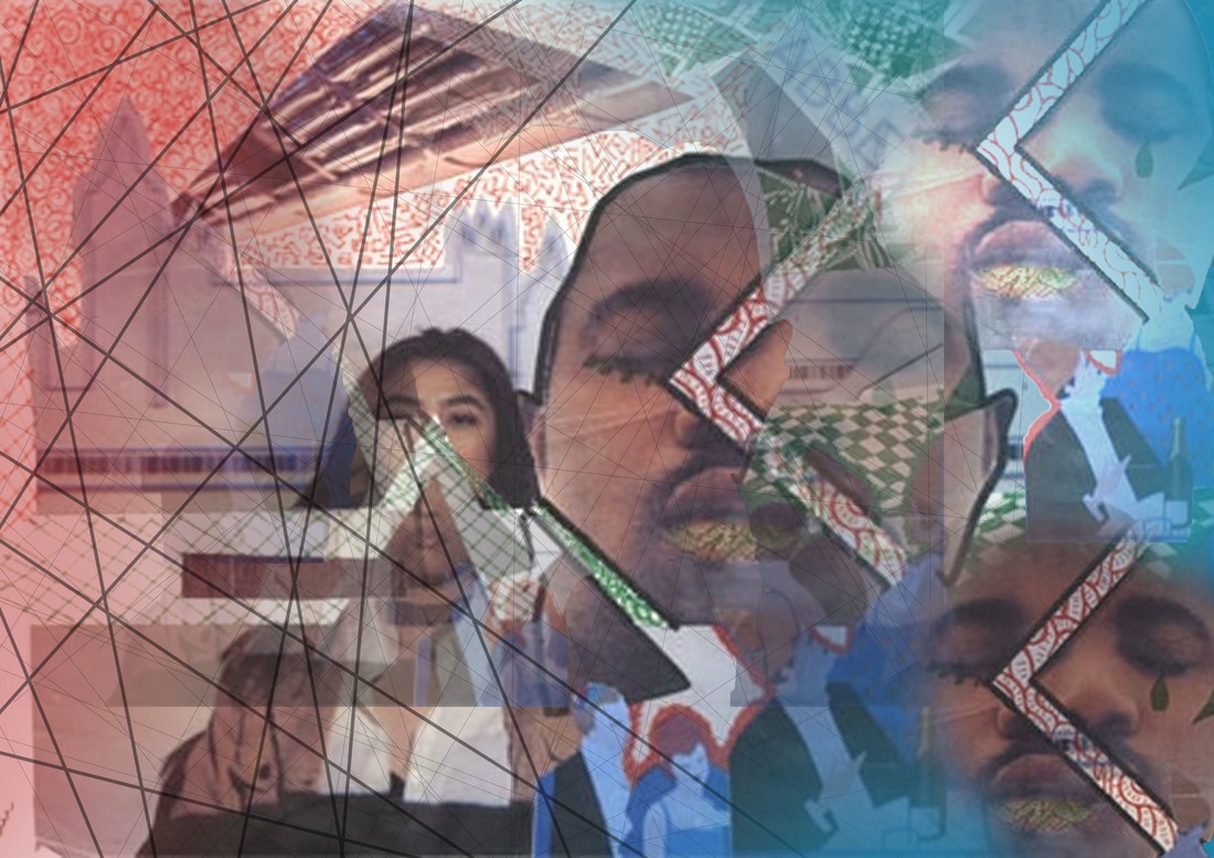
For my first poster (A) I tried to convey the message of labyrinthine in more depth. I made sure I used all my contextual knowledge on the theme and what it took to get there. I have pix-elated each image to create confusion, I didn’t want people to look at my work and decipher the message instantly I intended on the image having an uncertainty. I did not try to confuse the public to much so I made sure I used cool colours such as baby blue, light grey and mauve. Looking at the designs I have sharp shapes to show dominance throughout the image. I also added another language to add a sense of awe. For poster (B) I created something that related to the theme motif so all the designs are repetitive. I wanted it to relate to my first poster so I kept the colours cool. This gives a cool and calm vibe when people view it. When I look at this poster I can see multiple patterns and it screams labyrinthine due to its irregular shapes and twisting.
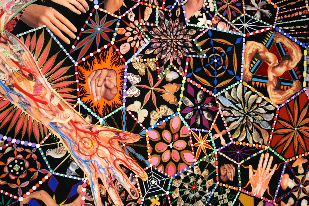
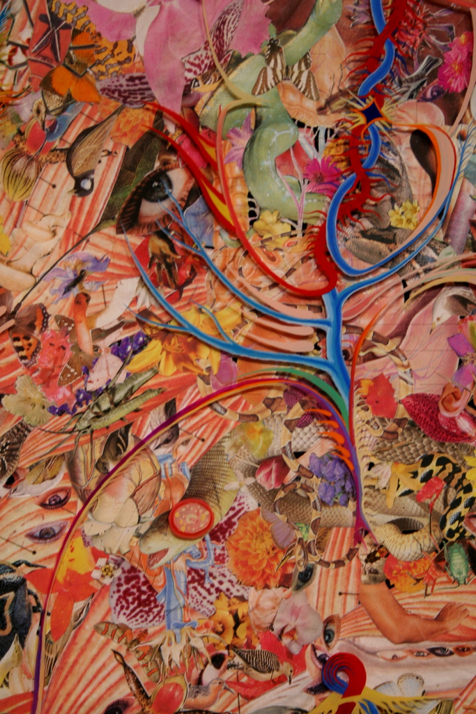
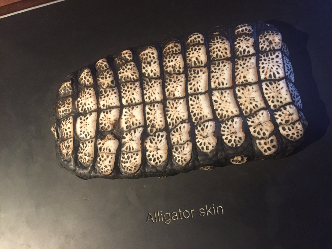
I have managed to incorporate every element of photography in every map and poster I have made. Image B consists of two pictures I took in France incorporated into one image and then edited on Photoshop I then added a third image of crocodile skin because the patterns were repetitive. I started by hand making image A I cut out and stuck many images rotating and flipping the Images i took from my photo-shoot in central London. Image C is a collage of one of my class mates posing in the museum. The background was bright and full of exploding colours I then layered it with another image that I took of soap. I found the colour bright pink unique and it caught my eye. The last image (D) was taken at an exclusive temporary exhibition in central London. I used the one image multiple times and changed the effects and colours on it.
When taking my images I used different techniques such as shooting in burst more. This technique was able to let me take multiple pictures all at once just by opening the shutter release. Whether you're taking a child's portrait or a group portrait set your camera in its fastest drive setting. You don't need to machine gun the shutter release, but shooting in short bursts will ensure you capture a fleeting range of expressions. It also improves your chances of getting a shot where everyone's eyes are open in a group portrait. I used long exposure this causes any moving element to be recorded as motion blur. My favourite photographic technique was slow exposure. I was able to see trails of lights moving along the image. I had to open the shutter for the desired time I wanted to. The longer you hold the shutter the the more the amount of light trails you see.
I started off with very basic ideas such as the theme of flags and the London underground logo. I didn’t leave it at that as I knew the ideas were to basic and straight forward. I wasn’t able to use different techniques when editing as I wasn’t aware of the software and I was not that advanced. Gradually I improved my editing skills on Photoshop and I was able to edit my initial outcomes turning it into a mock up. I discarded the outcomes as I didn’t feel it was good enough to submit to as a final outcome. researching the methods and key interpretations i needed to create a better design i was able to create and develop unique ideas adding distortion and vibrant colours in some of them.
(include light boxes underneath this paragraph)
For my first poster (A) I tried to convey the message of labyrinthine in more depth. I made sure I used all my contextual knowledge on the theme and what it took to get there. I have pix-elated each image to create confusion, I didn’t want people to look at my work and decipher the message instantly I intended on the image having an uncertainty. I did not try to confuse the public to much so I made sure I used cool colours such as baby blue, light grey and mauve. Looking at the designs I have sharp shapes to show dominance throughout the image. I also added another language to add a sense of awe. For poster (B) I created something that related to the theme motif so all the designs are repetitive. I wanted it to relate to my first poster so I kept the colours cool. This gives a cool and calm vibe when people view it. When I look at this poster I can see multiple patterns and it screams labyrinthine due to its irregular shapes and twisting.
I have managed to incorporate every element of photography in every map and poster I have made. Image B consists of two pictures I took in France incorporated into one image and then edited on Photoshop I then added a third image of crocodile skin because the patterns were repetitive. I started by hand making image A I cut out and stuck many images rotating and flipping the Images i took from my photo-shoot in central London. Image C is a collage of one of my class mates posing in the museum. The background was bright and full of exploding colours I then layered it with another image that I took of soap. I found the colour bright pink unique and it caught my eye. The last image (D) was taken at an exclusive temporary exhibition in central London. I used the one image multiple times and changed the effects and colours on it.
When taking my images I used different techniques such as shooting in burst more. This technique was able to let me take multiple pictures all at once just by opening the shutter release. Whether you're taking a child's portrait or a group portrait set your camera in its fastest drive setting. You don't need to machine gun the shutter release, but shooting in short bursts will ensure you capture a fleeting range of expressions. It also improves your chances of getting a shot where everyone's eyes are open in a group portrait. I used long exposure this causes any moving element to be recorded as motion blur. My favourite photographic technique was slow exposure. I was able to see trails of lights moving along the image. I had to open the shutter for the desired time I wanted to. The longer you hold the shutter the the more the amount of light trails you see.
I started off with very basic ideas such as the theme of flags and the London underground logo. I didn’t leave it at that as I knew the ideas were to basic and straight forward. I wasn’t able to use different techniques when editing as I wasn’t aware of the software and I was not that advanced. Gradually I improved my editing skills on Photoshop and I was able to edit my initial outcomes turning it into a mock up. I discarded the outcomes as I didn’t feel it was good enough to submit to as a final outcome. researching the methods and key interpretations i needed to create a better design i was able to create and develop unique ideas adding distortion and vibrant colours in some of them.
(include light boxes underneath this paragraph)

|

|


|

|


|


|
I explored in the most productive way for each of my images I made sure none of them looked similar so this involved me using different techniques. For image A Image as I used my hands to develop most of my techniques I used different skills when cutting. I used the scratch method for the images that depicted faces. I was able to get a scalpel knife and scratch out the faces vigorously. I then cut out strips of paper and lined it across the paper. Some horizontal and some portrait. The original image A was just an experimentation of my ideas and techniques. To develop this I used the print scanner and scanner my images onto Photoshop. For image B I edited it on Photoshop and was able to use the merging tool to create a nice background. I also used the opacity tool to change the transparency of things.
I researched the four artists thoroughly so I had enough contextual evidence on research and influence. The first artist I researched was Aaron Siskind he was a photographer that captured architectural structure and nature. I believed this was a great artist to start off with as he focused on the patterns more than the actual object itself this helped me to think of brand new way I could portray the theme labyrinthine. I started to relate my images and designs to patterns related to architectural designs and building structure. I was also able to focus on nature and zoom into to the patterns such as the veins on a leaf. When it came to my second artist I decided to widen my range and go for an artist that does fine art. (Find out the name of the artist) draws and paints different shapes and colours also known as abstract painting he paints individual shapes and patterns and distorted them by making some shapes black and bold. By now I would have had two Artists and two pieces of knowledge on both of them. The last artist I did was Fred Tomaselli. He was towards the end of the project I found that he related more to my development of my work than an actual influence. He was the final outcome of my work and all the development and experimentation's relating to his work. I was able to do some research on him to show the relation between both our pieces of work.
I was able to take inspiration from both artist and incorporate them into my own ideas such as the colours and shapes used by ( find out the artist name). when It came to the photo-shoots I was able to use Siskinds techniques and zoom into the chosen objects this gave the image texture and it brought a 3D element towards the picture. I learnt that each artist is different in their own unique way as artists create a huge image to portray a huge message and some create small basic images to portray loud messages. Either way they all have a valid message they want to give out to the public.
I feel that three of my final pieces were a success as they relate to the theme labyrinthine hi
